Categories
Product Design VisuaI Design

How Do We Capture Style Preferences at Sign-Up?

fnumber

Should we present images using a Tinder-like design pattern? Or image grid? One of the fun challenges of UX design is creating a solution that’s just right for the business, the product and the customer. This post walks through the UX team’s process for defining and solving a problem.

Defining the UX Problem

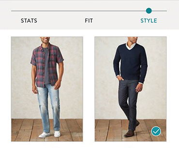
As part of our new men’s service at Stitch Fix, we created a style profile for men to indicate their preferences. During a closed beta period, we tested several questions and identified those to include in the public launch.

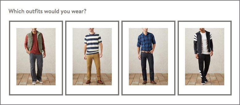
One of the questions – the style sphere – asked which outfits they would wear. In the beta test, we presented customers with 24 different outfits. We learned that they enjoyed answering the question, and that a diversity of images was key to helping them feel like we had captured the breadth of their preferences.

original_survey

The style sphere question was initially created using a third-party survey tool, optimized for desktop.

When presented with the task of designing the style sphere question-and-answer component for the men’s public launch, the UX team identified several questions:

  • How do we get customers to evaluate as many images as possible while keeping it fun and fast? Would 24 feel like too many, especially for mobile phone users, leading to decision fatigue or drop-off?
  • What’s the right trade-off between size of image and perceived length of question? What level of detail will users need to see in order to assess each outfit?
  • Should the outfits be presented in a specific order?
  • How will the business use the customer data, and how might this inform the UX thinking?

Collectively, these questions pointed to the key UX problem of: How do we present a large batch of images on the phone, so users can easily evaluate each style?

Cross-Functional Decision Making

At Stitch Fix, a core team of stakeholders meet to determine direction and scope at key points throughout a project. For customer-facing projects, the team typically includes strategy, marketing, data science, UX and engineering team members, and sometimes merchandising, styling and customer service partners. Once the UX team identifies key questions, we take them to the core team for discussion. This critical step shapes the path of UX research and design and ensures that we’re working on the right problem at the right time.

    For the style sphere question, the team decided on the following:
    • Number of images: Including 24 outfits was beneficial for showing a diversity of styles during beta testing on desktop, so we agreed to rely on user research to determine if it would cause fatigue or frustration on a phone.
    • Size and length: The balance between image size and length of the question would also be determined by user research.
    • Ordering: We randomized the order of images to reduce the chance of earlier or later images receiving more attention from users.
    • Business goal: The goal of the merchandise and styling teams is to understand the customer preferences for style genres, such as All-American, Athletic, or Hipster. Encouraging the customer to assess the whole style is more important than having them hone in on specifics, like shirt pattern or shoe type. User research would help us understand how the presentation of the question would support this goal.

    Planning

    Based on what we wanted to learn, we chose the research methodology and level of fidelity – usability testing an HTML prototype. In order to accurately gauge the speed and ease at which users would answer the question, we needed a real-time interactive prototype. This meant that we needed to get the project on the engineering roadmap. Our engineering resources were in demand, so it was critical to plan ahead.

    Design

    Rapid Sketching

    Our UX team meets bi-weekly to share projects and hold workshops, so it’s a perfect time to tap into the talents of the team and occasional visitors who drop by. An effective group brainstorming technique we employ is based on the 6-8-5 method, adapted by Google Ventures into Crazy 8s. With a group of seven people, we rapidly created over 50 sketches for the style sphere question.

    rapid_sketching

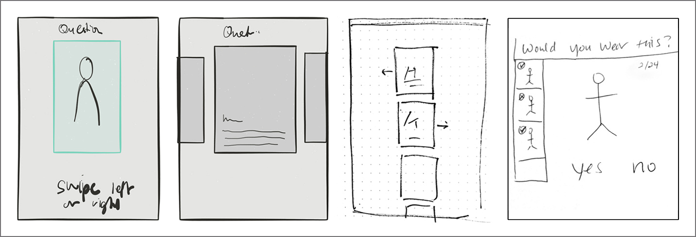
    Ideas ranged from Tinder-like swiping to thumbnail summaries, created with the iPad and by hand.

    Mockups

    We further explored and refined the brainstorming concepts on paper, then used Sketch to mock up the designs we wanted to test. Having already created a design system for the women’s style profile, we were able to quickly build high fidelity mockups to present to business partners. During our weekly core project team meeting, we reviewed the designs to ensure alignment before testing.

    refined_sketches

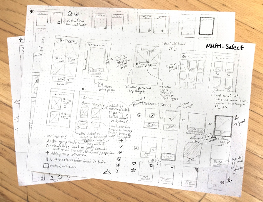
    Refined sketches allow for continued, quick exploration of interface layouts and details.

    User Research

    What to Test

    We tested two versions of the question on mobile web: 1-column and 2-column. To get a realistic read on levels of difficulty and fatigue, we set up a staging site with the actual onboarding experience and included the question in situ. We ran two sets of usability studies. In the first study, the user saw the 1-column version in the context of the style profile. After completing the profile, he interacted with the 2-column version, then was asked to compare them. In the second study, we reversed the order to reduce bias. We also enabled pinch-and-zoom functionality to observe whether or not anyone would naturally use it.

    test_layouts

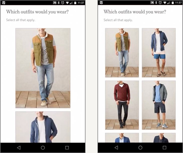
    1-column and 2-column layouts for testing

    Usability Insights

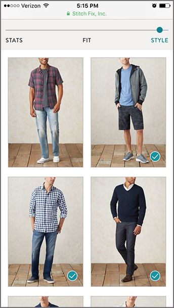
    Most users preferred the 2-column version:


    • It felt faster and easier to scroll through and complete the question.
    • The smaller image size made it easier to process each image.
    • Seeing more than one image at a time helped users make decisions.
    • No one tried to zoom into the images or tap to get a larger size.

    Two of the 12 participants had no preference between versions. One man did prefer the 1-column version – he said it was easier for him to see each image.

    We noted several negative responses to the 1-column version:


    • It felt “confining”.
    • There was too much scrolling; it felt too long.
    • It felt like there were too many options. One user exclaimed, “You’ve got a lot of different options here, holy crap! [It’s] going slower than I want.”
    • It was tedious and harder to make a decision about each outfit.
    • We observed that users spent more time considering each image in the 1-column version; we believe that seeing more detail in each image made it harder to assess the outfit as a whole.

    Testing Conclusion

    Circling back to the UX problem of how to present a large group of images for easy and quick evaluation, we had an answer: The 2-column layout was more effective. The size of the images worked well for conveying overall style, and the ability to see multiple images at once increased the speed and ease of answering it. Showing 24 images in the 2-column layout did not feel too cumbersome or tedious, so there was no clear UX rationale for reducing the number of images.

    Takeaways

    launch_layoutThere are many different ways that we could have designed a 24-image question with yes/no answers. In this case, several team members had envisioned a Tinder-like interface with individual cards. By initially testing one image per screen versus four images, we learned that users preferred to see multiple images at once, pointing us away from pursuing the Tinder pattern. Not only were users able to make decisions more quickly and easily, but they also focused on the outfits as a whole. The resulting data allows our stylists to better select items that the customers will love.

    With a clear winner that worked well for the customer and the business, the UX team could take on the next challenge in the revolution of shopping.

Categories
Design Education Product Design VisuaI Design

Visual Design Principles, Simplified

Applying design principles to visual communications increases clarity, readability and memorability of the intended message. Five key principles include hierarchy, proximity, alignment, contrast and repetition. These principles can be demonstrated simply with nine-square grids:
vdp_grids_all_09
Following are brief explanations of each principle, along with good and bad examples applied to postcard designs.

Hierarchy: prioritizing information based on importance.

Good use of hierarchy ensures that the most important items are noticed first, and it guides the viewer’s eye through the page or screen to see additional information.
 
vdp_hier_03

In this example, the nightcrawler is the first read. It takes priority through the use of size, color, shape and texture. The title and body copy blocks are secondary reads, and the copyright information is the last read.

vdp_hier_bad_06

This postcard for web development services displays a poor example of hierarchy. The four boxes and titles are of equal size, resulting in a busy layout with no clear priorities.


Proximity: grouping, or chunking, elements together.

Proximity helps the viewer interpret information correctly and easily by showing which elements are associated with each other.
 
vdp_prox_03

Information on the Fear Over Frisco postcard is grouped into sections according to meaning: performance group and event name, tagline, headline and logistical information.

vdp_prox_bad_06

The back of this postcard for a band does not make use of proximity. Information is divided into sections, including LP Discography, Media Coverage and Press Quotes, but without any spacing between the sections it is difficult to quickly grasp them. The result is another busy layout that viewers would likely not invest time in reading.


Alignment: lining up and organizing content using a grid.

Aligning elements creates structure, making information easier to grasp.
vdp_align_03

The Fine Art of Poisoning card employs a centered alignment from the dead body’s face to the copy blocks and row of images. The text and images are also aligned to the margins of the card, and the three images are aligned horizontally. All of these choices result in a structured, organized layout.

 
vdp_align_bad_07

A calendar is a perfect example of content that can be aligned to a regular grid, but in the case of this yoga class schedule, the designer missed an opportunity to make the card more readable. As shown by the gray line overlays, the size of the columns and gutters are uneven, and there is a missed opportunity to horizontally align the type at the bottom.

Contrast: differentiating content.

Contrast creates clarity and readability.
vdp_contrast_07

This card for a wedding reception party uses contrast effectively. To the right is an exaggerated version that highlights the key areas of contrast—the bride’s veil and the white type.

 
vdp_contrast_bad_08

This card for a yoga instructor is difficult to read due to lack of contrast. The headline, set in a fancy typeface, does not stand out against the body due to ineffective use of the drop shadow, type color and placement. The URL at the bottom does not have enough contrast to stand out effectively against the yoga mat. Additionally, the shapes created by the body, its shadow, the landscape and the headline all lead to a busy, confusing design. The high-contrast version to the right exaggerates the problems.

Repetition: using similar elements or properties of elements multiple times.

Repeating elements unifies and organizes a layout to direct the viewer’s eye across a page.
vdp_rep_08

The Eyes of Tammy Faye card uses repetition of color and shape effectively. The reds draw the eye around the page, all the way to the bottom, and the black mascara-laden eyelash shape is cleverly repeated to call out the narrator’s name (RuPaul Charles).

vdp_rep_bad_08

This promotional card for a printer also incorporates repetition of shape and color (rectangles and reds), but overall it’s not effective in leading the eye through the design. Other principles that are poorly executed on this card contribute to the problem.

All Principles at Work

The promotional card for 4by6, a printer based in Oakland, California, is an excellent example of the five principles at work. For hierarchy, the photo is the first read, and the G46 headline is the second read. The repetition of the blue color helps guide the eye around the card, as does the grouping of information into logical sections. Contrast is evident in the type colors and photo against the white background. vdp_all_14
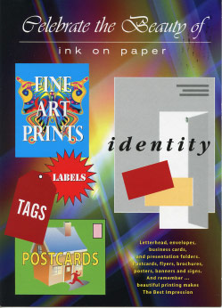
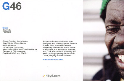
The size differences between the photo, headline and body copy are another form of contrast. Alignment provides the structure: three elements are aligned along the left margin, the two copy blocks are top-aligned and the logo is left-aligned to the second copy block. Balance, another principle, is achieved through good use of proportions and the placement of the G46 headline in relation to the man’s eye-catching expression, particularly the mouth.

Make Life Easier for People

As illustrated by these postcard examples, skillful application of visual design principles makes the difference between a professional, clear communication piece and an amateur one. Good design minimizes the cognitive work required by people, making the process of navigating through our information-dense world a little easier.
 
Image copyrights are held by their respective brands and licensors.

Categories
Product Design

Find, Discuss and Choose Art Together

Opportunity: A Group Gallery Feature for Art.com

Background

Art.com is a leading worldwide retail site that sells fine art prints and decorations. Their tagline is “Find your art. Love your space.” The website has numerous features that make discovering and buying art an engaging and fun experience, including a visual search tool and expert interior decorating tips.

I have a rich background in fine art and design, and I enjoy exploring and immersing myself in works of art. I noticed that Art.com was working on the next generation of their website, so I decided to brainstorm ideas for a product feature that I could create as a UX designer.

What’s Missing on the Current Site?

One thing I love about viewing art with friends is comparing our unique reactions to it. It’s also rewarding when we experience a transformational moment together, inspired by the art. On Art.com, I can create my own personal gallery and share the images with my friends on Facebook, but somehow it feels like a lonely thing to do.

“I can create my own personal gallery and share the images with my friends on Facebook, but somehow it feels like a lonely thing to do.”

brainstorm1
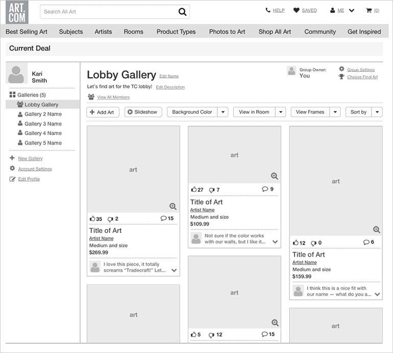
This feeling led me to start brainstorming ways to make the experience more fun and social. I sketched and surfed the web and made notes and sketched some more. I had a rough idea of a new feature, and then I performed guerrilla user research on several art-loving peers to validate my assumptions and gain further insights. I created provisional personas to help me pinpoint the behaviors, needs and goals of users.

The Idea and Opportunity

The resulting idea: add a group gallery feature to the Art.com website so that people can select, discuss, and vote on art together, usually with the goal of making a final purchase. From a business perspective, the feature would expose new potential customers to Art.com — those who are invited to the group must sign up for an account in order to participate in the group. (It’s likely that many of the group members would not have joined the site on their own.)

“…people can select, discuss, and vote on art together, usually with the goal of making a final purchase.”

brainstormAn early visualization of the group gallery feature.
 

UX Design Process

kari_personaPersonas and Use Cases

Meet Kari, one of the personas. She is a 27-year-old marketer working at a startup with 15 other coworkers. They just moved into a new office space in San Francisco’s SOMA neighborhood, and the founders are open to everyone’s ideas about how to make the space more fun and beautiful. The lobby area has a large, open wall that Kari thinks would be the perfect spot for a painting. She would love for the team to choose the artwork together so that everyone feels a sense of shared ownership in making the office more beautiful.

    Other users with similar needs and goals include:

  • Family members who wish to collaborate on choosing art to decorate their walls
  • People in shared living situations, including college roommates, couples, and people who share apartments in densely-populated urban areas like New York City and San Francisco, who wish to purchase art together
  • Groups of friends who wish to combine funds to purchase a wedding or other gift for mutual friends
  • Property management personnel who are charged with choosing or updating art for public areas of buildings

Design Stories

Starting with the high level design story—Kari can choose art with her co-workers for the lobby wall—I brainstormed and edited the sub-level stories to clarify what users can and cannot do with the new product feature. There are over 50 design stories in total. Below are a few examples.

    Create a group galleryepic_story

  • Name it (optional)
  • Add a description (optional)
    Invite members to the group gallery

  • Enter email addresses
  • Invite friends via Facebook
  • Edit the default invite message
  • View list of invited people
  • Re-invite members
    Finalize art selection(s)

  • Choose final art piece(s)
  • Edit a default message
  • Send notification to all members
    Vote on art in the group gallery

  • Vote up
  • Vote down
  • Change vote
    Comment on art in the group gallery

  • Add a comment
  • Confirm comment before adding it
  • Add more comments to the same piece or another piece
  • Delete your comment

Task Flows

On sketch paper, I mapped out the relevant, existing user flows on Art.com’s site, including those for choosing art and creating a gallery, to familiarize myself with entry points into the new flows. Next, I worked through and refined new flows based on the design stories. Then I focused on two key stories—create a group gallery and invite members to join—and created a polished flow in OmniGraffle.

Flow_cropView the full-size task flow.

User Interface Sketches

Combining my original UI sketch with the fleshed out design stories and task flows, I started working through the interface flows. At this point I researched design patterns and walked through similar flows on comparative sites.
sketch-refinedFinal sketches for the interface flows.

Prototype

I built wireframes in Omnigraffle and a clickable prototype using Marvel to bring the concept to life. Designing the interaction and interface details at this stage forced further refinement and careful integration with the website’s existing UI.
prototypeView the full-sized, clickable prototype.

Wireframe

The final wireframe shows the group gallery once it is in use. Interface additions and adjustments have been made to the site’s current My Profile > Personal Gallery screen to optimize for the new feature. The header area includes settings for the group owner, which are not all visible to group members (group members can view the owner’s name and thumbnail image, and they can see the “View All Members” icon and link.)

art_galleryView the full-size wireframe.

The art selections are sorted in order of most votes to least votes, so members can quickly assess the top-voted pieces. The user’s profile image size has been reduced to improve the overall screen hierarchy by allowing the art to take center stage.

Final Thoughts

The new feature is complex and needs to be validated by further qualitative user research. My hunch is that it will prove to be an excellent opportunity to serve the desires of current and new users and to increase sales for Art.com.

View this post on Medium.

Categories
Product Design

User Testing the ChickRx Beta Site

chrx_plainChickRx is a new community for women which focuses on wellness and beauty. Their tagline is “Expert advice to get happy, healthy and hot.” Two key product features are: 1) Customers can ask questions, either publicly or “secretly,” and 2) Customers can get answers from experts and peers. A third feature is that customers can help other women by answering their questions.

When I first learned about the company, I was excited and supportive of their vision, and I took their beta website for a test drive. From my user experience design perspective, I found a host of issues. I decided to run usability tests on key features of the product to identify patterns and clarify the problems. Most importantly, I wanted to discover whether or not women could easily use the features that are the core focus of the product. I created four tasks to test.

The Tasks

1.  Ask a question (about health or beauty).
2.  Ask another question to an expert.
3.  Check the status of the answer to your question.
4.  Answer someone else’s question.

Provisional Persona and Interview Subjects

The provisional persona is Brittany, a woman in her early 30s. She is an urban dweller who loves beauty tips and trends and is interested in being fit and healthy. She follows a couple beauty bloggers online and often shares beauty and wellness tips with friends. To get answers to her most personal health issues, she searches online or discusses them with her mom and doctor.

For the usability tests, I recruited five women who share many similarities with Brittany. I gathered background information on each woman’s level of interest in health and beauty subjects and how she typically uses the internet to find information on those topics. This information helped me better understand each person’s performance on the tasks.

chrx_shareUser Quotes

After running the first test, I realized that the path to completing every task was problematic on multiple levels, beyond what I encountered in my own experience of using the product. The following quotes from users pointed to problems with the interaction flow, messaging and overall brand.

  • “Eww, it’s required!”
  • “That’s weird! Why would they want you to share it if you asked secretly?”
  • “Was my question submitted?”
  • “Where did my question go?”
  • “I know it says ‘ask secretly,’ but it didn’t register that my question would show up publicly.”
  • “I don’t trust this.”
  • “I feel like I’m being tricked.”

Test Insights

task_insightsAfter testing the five subjects, I charted the success of each task and listed specific stumbling blocks on yellow sticky notes. As shown on the chart, only one task was completed without difficulty, by one user. Two tasks were completed, with some difficulty, by the majority of users. The remaining two tasks were considered a failure.

The most important task of the site—asking a question—was a frustrating process, in which users either abandoned the task or waded through the process feeling annoyed and tricked by the company.


A Closer Look at the Problems

chrx_ask_autofill
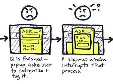
For Task 1, test subjects were told to use the site to answer a personal question on a health or beauty topic. Most users immediately jumped to the large search field and started typing in the question. Before finishing, the site provided suggestions for questions, which was confusing to some users. The example screen shows that the suggestions could vary wildly and pop up prematurely, before a key topic was provided.
 
chrx_ask_tagsOnce the complete question had been asked (and no predictive suggestions matched it), a modal popup appeared to prompt the user for more information. This interrupted the flow for users, who were generally annoyed and felt mentally taxed by having to read the requirements. If they closed the window, they would not get to submit their question.
 
chrx_ask_popupsAfter begrudgingly filling out the form and then choosing either “Ask” or “Ask Secretly,” another modal window popped up. This required the user to sign up or log in, in order to continue asking the question. This action led most users to feel “tricked,” which angered them and diminished their trust. At some point, a third modal window—another sign in feature—also appeared behind the other two, adding more confusion. Closing these windows would lead to a failure in getting the question asked, so users felt trapped and extremely annoyed at this point, if they were still engaged at all.
 
task_emoA summary of the user flow and response to Task 1: Ask a question.

Prescription: Better UX Design

ChickRx needs professional UX relief, fast. What’s the remedy? Let’s examine a few ideas.

solution-2
Giving the user value before requiring them to sign up is a good practice.

1.  Follow the example of Medium and other sites: give value to a new user by allowing her to engage with the site before asking her to sign up. This would eliminate the sign-up windows that popped up at inopportune moments.
2.  Rather than mimicking Google’s autocomplete prediction model, take a cue from Quora: allow the user to ask a question—without interruption—then present a popup that checks for similar, existing questions.
3.  Give the user feedback after she asks a question. At the very least, a confirmation message should appear. A better idea is to display the question with editing options. The site needs to evoke a sense of trust and safety in order for users to feel comfortable asking personal questions. Giving the user a chance to immediately delete or reword her question would increase trust.

solution-1In the proposed interface flow, the user asks a question and the site checks for similar, existing questions. If the user continues with her question, the next screen displays her question, confirming that it was asked.

These ideas are the seeds for a better UX design solution and a more positive response from the user.
 

Categories
Design Education Product Design

Grow Your Brain for Greater Success

The following content was delivered as a presentation entitled, “Let’s Get Bigger Brains,” to a group of Toastmasters in 2010.

Maintaining Success

Most of us desire success, however we personally define it. Once we achieve a level of success, maintaining it is not something that we can take for granted. We cannot simply rest on our laurels, or maintain the status quo. What made us successful in the past doesn’t necessarily guarantee success in the future.

Our Nature Can Work Against Us

3By nature, we crave comfort and an easy life, and we avoid change. This may keep us in the status quo for awhile, but as change happens, we may lose our status, cling to how things used to be and become jaded critics. This can become a downward spiral. I’m sure you all know a few naysayers or curmudgeons.

From the brain’s point of view, this mental laziness and negative attitude make us less able to adapt to change and process new information. With the world changing rapidly around us, it is imperative that we bring these mental habits to light and learn new ways to work with normal but unhelpful tendencies.

The question then is: How can we improve our mental habits to help build and maintain our successes? The answer: Get a bigger brain! (Our head won’t get visibly bigger, but the cortex—the outer wrinkled covering of the brain—can get thicker and denser.)

5The Field of Neuroscience Provides the Answers

Luckily for us, the field of neuroscience has been growing and can provide solutions. The most promising discovery, from the late ’90s, is that we can grow new brain cells (neurons), and we can form new connections between existing cells. This is called neuroplasticity. It’s good news for those of us who thought we killed too many brain cells in our youth!

The catch is that we have to “use it or lose it.” New cells grow, but if we don’t have enough brain activity, we won’t be able to capitalize on it. Knowing this, and understanding how to harness new cell growth, are the keys to a bigger brain.

Setting the Stage for New Cell Growth

5bTo set the foundation for brain cell growth, we need to lead a relatively stress-free life. Stress inhibits cell growth and cognitive ability, and it even kills cells and causes brain shrinkage. Solutions for stress reduction include meditation, yoga, relaxation techniques, good time management, delegation of tasks and avoiding or saying “no” to stress-inducing situations, people and jobs.

A nutritious diet, adequate sleep and exercise are also essential foundations for new cell growth. Increased blood flow to the brain through exercise helps support new neuron connections.

Continuous Learning

Once the foundation is in place, continuous learning is key. Carol Dweck, a Stanford psychologist, coined the phrase “growth mindset,” which is the idea that we can learn new skills and knowledge at any time in life, as opposed to having a fixed brain capacity that stays with us throughout our lives.

Research shows that the more education and skills a person acquires, the higher their income.

Brain cell growth thrives on variety, novelty and challenge. Listed here are examples of activities that will increase brain cell growth:

    6

  • Learn to play an instrument: Learning something that may be difficult at first is a good challenge for the brain. There is no rush to master the instrument—it is the ongoing process of learning that changes the brain.
  • Learn a new language: Tapes, classes and immersive travel are great ways to learn a new language.
  • Travel and explore: Adapt to new surroundings and learn about new cultures.
  • Integrate what you learn: Write about what you are reading, watching and studying. If you’re learning new software skills, incorporate them into a new project. Teach someone else what you’ve just learned, or deliver a presentation on it.
  • 7

  • Cultivate stimulating social relationships: Spend time having fun and communicating with others, especially with people who enjoy thinking and learning.
  • Verbal reviews: Tell a friend about something you read or watched, even if it’s a mindless film or TV show.
  • Play games, learn new sports, dance or act.
  • [Updated:] Play brain training apps, like Lumosity or Fit Brains!

9Conclusion

By now, your brain should be a little bit bigger, because hopefully you’ve learned something new. Growing your brain requires effort, but you can make the process fun, interesting and social. I highly recommend that you get started now: Choose one of the ideas listed above that you are excited about, and start implementing it within the next couple of days. Turn it into a regular practice, and you’ll be on your way to creating a habit that can lead to greater success in life.

Categories
Books Product Design

Hmmm, Cool New App — Should I Bother With It?

book cover

You’ve most likely asked yourself a similar question before signing up for a new web or mobile app. You may have been excited about the promise of what the app could do for you, but you still had to decide: should I bother? Do I want or care enough to invest my time, attention, effort, or money?

According to Lean UX expert Laura Klein, the “Should I Bother?” question highlights one of the biggest blocks to converting users to the next level in a product. Depending on the product and the user’s current level of interaction with it, the next level could mean: signing up for a service, returning regularly, or converting into a paying customer.

In her webcast, “The Three Reasons Users Don’t Convert,” Laura explains the major issues that prevent users from converting to the next level within a product. She briefly covers the Lean UX testing methodologies that can be used to solve each issue. Her book, UX for Lean Startups, is a great resource for expanding on those methods.

Users Don’t Get the Product

People spend very little time checking out a new product before deciding whether or not to use it, so it’s important to test the main messaging of the product to ensure that people get it. Testing methodologies:

  • Five second tests
  • Guerrilla usability testing
  • Site intercept

Outcome: adjust and clarify the product messaging as needed so people can quickly grasp what it does.

Users Don’t Need the Product

The product may be solving a problem, but not one that the target users actually have. Testing methodologies:

  • Contextual inquiry
  • Observational testing
  • Customer development

Outcome: clearly understand a specific group of people’s context and issues, and then ensure that the product solves their unique problems.

Users Don’t Want It Enough

This brings us back to the first idea; the user might understand what a product does and see its value, but does she care enough? Is it worth investing precious time, attention, effort, or money? Will it be more trouble than it’s worth? Testing methodologies:

  • Usability testing
  • Pre-build commitment
  • Price optimization

Outcome: ensure that the product solves a big enough problem and has the right price point to match customer needs and goals.

By addressing these common issues around customer conversion, companies can build better products that more effectively meet people’s needs.