Should we present images using a Tinder-like design pattern? Or image grid? One of the fun challenges of UX design is creating a solution that’s just right for the business, the product and the customer. This post walks through the UX team’s process for defining and solving a problem.
Defining the UX Problem
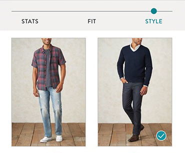
As part of our new men’s service at Stitch Fix, we created a style profile for men to indicate their preferences. During a closed beta period, we tested several questions and identified those to include in the public launch.
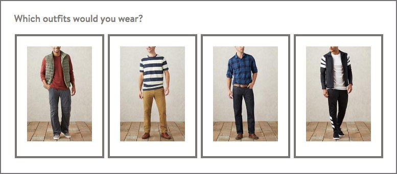
One of the questions – the style sphere – asked which outfits they would wear. In the beta test, we presented customers with 24 different outfits. We learned that they enjoyed answering the question, and that a diversity of images was key to helping them feel like we had captured the breadth of their preferences.
The style sphere question was initially created using a third-party survey tool, optimized for desktop.
When presented with the task of designing the style sphere question-and-answer component for the men’s public launch, the UX team identified several questions:
- How do we get customers to evaluate as many images as possible while keeping it fun and fast? Would 24 feel like too many, especially for mobile phone users, leading to decision fatigue or drop-off?
- What’s the right trade-off between size of image and perceived length of question? What level of detail will users need to see in order to assess each outfit?
- Should the outfits be presented in a specific order?
- How will the business use the customer data, and how might this inform the UX thinking?
Collectively, these questions pointed to the key UX problem of: How do we present a large batch of images on the phone, so users can easily evaluate each style?
Cross-Functional Decision Making
At Stitch Fix, a core team of stakeholders meet to determine direction and scope at key points throughout a project. For customer-facing projects, the team typically includes strategy, marketing, data science, UX and engineering team members, and sometimes merchandising, styling and customer service partners. Once the UX team identifies key questions, we take them to the core team for discussion. This critical step shapes the path of UX research and design and ensures that we’re working on the right problem at the right time.
- For the style sphere question, the team decided on the following:
- Number of images: Including 24 outfits was beneficial for showing a diversity of styles during beta testing on desktop, so we agreed to rely on user research to determine if it would cause fatigue or frustration on a phone.
- Size and length: The balance between image size and length of the question would also be determined by user research.
- Ordering: We randomized the order of images to reduce the chance of earlier or later images receiving more attention from users.
- Business goal: The goal of the merchandise and styling teams is to understand the customer preferences for style genres, such as All-American, Athletic, or Hipster. Encouraging the customer to assess the whole style is more important than having them hone in on specifics, like shirt pattern or shoe type. User research would help us understand how the presentation of the question would support this goal.
- It felt faster and easier to scroll through and complete the question.
- The smaller image size made it easier to process each image.
- Seeing more than one image at a time helped users make decisions.
- No one tried to zoom into the images or tap to get a larger size.
- It felt “confining”.
- There was too much scrolling; it felt too long.
- It felt like there were too many options. One user exclaimed, “You’ve got a lot of different options here, holy crap! [It’s] going slower than I want.”
- It was tedious and harder to make a decision about each outfit.
- We observed that users spent more time considering each image in the 1-column version; we believe that seeing more detail in each image made it harder to assess the outfit as a whole.
Planning
Based on what we wanted to learn, we chose the research methodology and level of fidelity – usability testing an HTML prototype. In order to accurately gauge the speed and ease at which users would answer the question, we needed a real-time interactive prototype. This meant that we needed to get the project on the engineering roadmap. Our engineering resources were in demand, so it was critical to plan ahead.
Design
Rapid Sketching
Our UX team meets bi-weekly to share projects and hold workshops, so it’s a perfect time to tap into the talents of the team and occasional visitors who drop by. An effective group brainstorming technique we employ is based on the 6-8-5 method, adapted by Google Ventures into Crazy 8s. With a group of seven people, we rapidly created over 50 sketches for the style sphere question.
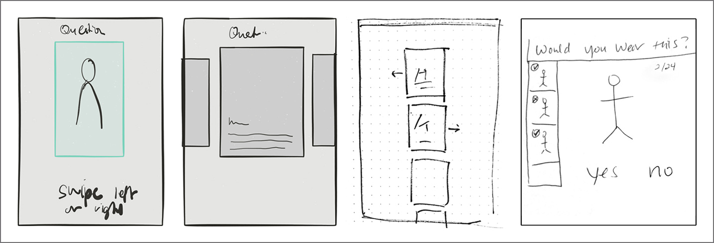
Ideas ranged from Tinder-like swiping to thumbnail summaries, created with the iPad and by hand.
Mockups
We further explored and refined the brainstorming concepts on paper, then used Sketch to mock up the designs we wanted to test. Having already created a design system for the women’s style profile, we were able to quickly build high fidelity mockups to present to business partners. During our weekly core project team meeting, we reviewed the designs to ensure alignment before testing.
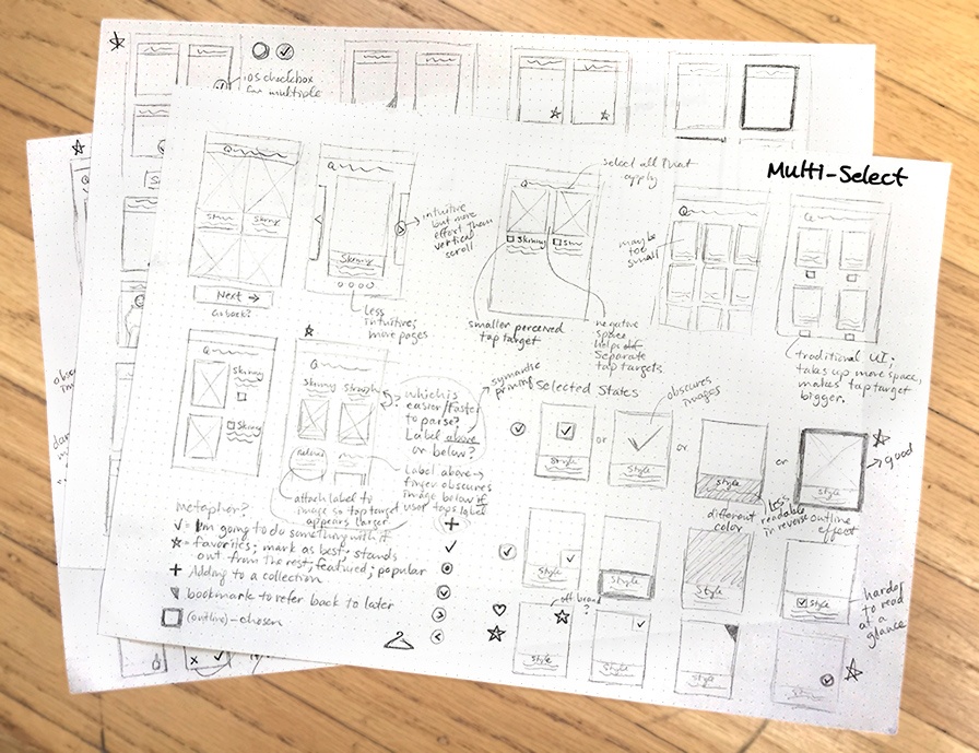
Refined sketches allow for continued, quick exploration of interface layouts and details.
User Research
What to Test
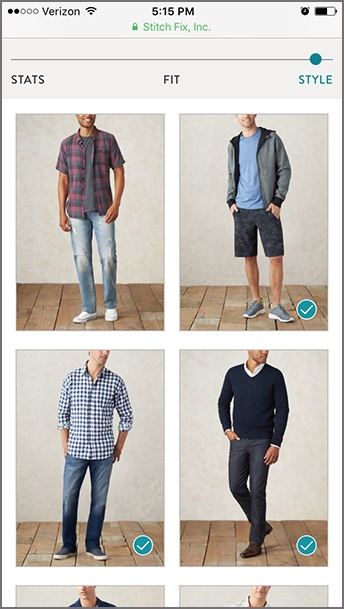
We tested two versions of the question on mobile web: 1-column and 2-column. To get a realistic read on levels of difficulty and fatigue, we set up a staging site with the actual onboarding experience and included the question in situ. We ran two sets of usability studies. In the first study, the user saw the 1-column version in the context of the style profile. After completing the profile, he interacted with the 2-column version, then was asked to compare them. In the second study, we reversed the order to reduce bias. We also enabled pinch-and-zoom functionality to observe whether or not anyone would naturally use it.
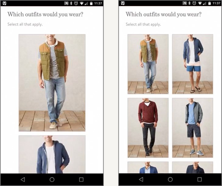
1-column and 2-column layouts for testing
Usability Insights
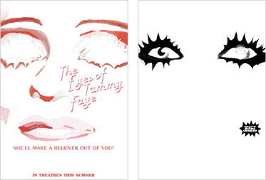
Most users preferred the 2-column version:
Two of the 12 participants had no preference between versions. One man did prefer the 1-column version – he said it was easier for him to see each image.
We noted several negative responses to the 1-column version:
Testing Conclusion
Circling back to the UX problem of how to present a large group of images for easy and quick evaluation, we had an answer: The 2-column layout was more effective. The size of the images worked well for conveying overall style, and the ability to see multiple images at once increased the speed and ease of answering it. Showing 24 images in the 2-column layout did not feel too cumbersome or tedious, so there was no clear UX rationale for reducing the number of images.
Takeaways
 There are many different ways that we could have designed a 24-image question with yes/no answers. In this case, several team members had envisioned a Tinder-like interface with individual cards. By initially testing one image per screen versus four images, we learned that users preferred to see multiple images at once, pointing us away from pursuing the Tinder pattern. Not only were users able to make decisions more quickly and easily, but they also focused on the outfits as a whole. The resulting data allows our stylists to better select items that the customers will love.
With a clear winner that worked well for the customer and the business, the UX team could take on the next challenge in the revolution of shopping.

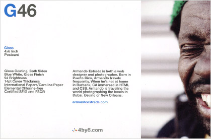 The size differences between the photo, headline and body copy are another form of contrast. Alignment provides the structure: three elements are aligned along the left margin, the two copy blocks are top-aligned and the logo is left-aligned to the second copy block. Balance, another principle, is achieved through good use of proportions and the placement of the G46 headline in relation to the man’s eye-catching expression, particularly the mouth.