 ChickRx is a new community for women which focuses on wellness and beauty. Their tagline is “Expert advice to get happy, healthy and hot.” Two key product features are: 1) Customers can ask questions, either publicly or “secretly,” and 2) Customers can get answers from experts and peers. A third feature is that customers can help other women by answering their questions.
When I first learned about the company, I was excited and supportive of their vision, and I took their beta website for a test drive. From my user experience design perspective, I found a host of issues. I decided to run usability tests on key features of the product to identify patterns and clarify the problems. Most importantly, I wanted to discover whether or not women could easily use the features that are the core focus of the product. I created four tasks to test.
The Tasks
1. Ask a question (about health or beauty).
2. Ask another question to an expert.
3. Check the status of the answer to your question.
4. Answer someone else’s question.
Provisional Persona and Interview Subjects
The provisional persona is Brittany, a woman in her early 30s. She is an urban dweller who loves beauty tips and trends and is interested in being fit and healthy. She follows a couple beauty bloggers online and often shares beauty and wellness tips with friends. To get answers to her most personal health issues, she searches online or discusses them with her mom and doctor.
For the usability tests, I recruited five women who share many similarities with Brittany. I gathered background information on each woman’s level of interest in health and beauty subjects and how she typically uses the internet to find information on those topics. This information helped me better understand each person’s performance on the tasks.
 User Quotes
After running the first test, I realized that the path to completing every task was problematic on multiple levels, beyond what I encountered in my own experience of using the product. The following quotes from users pointed to problems with the interaction flow, messaging and overall brand.
- “Eww, it’s required!”
- “That’s weird! Why would they want you to share it if you asked secretly?”
- “Was my question submitted?”
- “Where did my question go?”
- “I know it says ‘ask secretly,’ but it didn’t register that my question would show up publicly.”
- “I don’t trust this.”
- “I feel like I’m being tricked.”
Test Insights
 After testing the five subjects, I charted the success of each task and listed specific stumbling blocks on yellow sticky notes. As shown on the chart, only one task was completed without difficulty, by one user. Two tasks were completed, with some difficulty, by the majority of users. The remaining two tasks were considered a failure.
The most important task of the site—asking a question—was a frustrating process, in which users either abandoned the task or waded through the process feeling annoyed and tricked by the company.
A Closer Look at the Problems
 For Task 1, test subjects were told to use the site to answer a personal question on a health or beauty topic. Most users immediately jumped to the large search field and started typing in the question. Before finishing, the site provided suggestions for questions, which was confusing to some users. The example screen shows that the suggestions could vary wildly and pop up prematurely, before a key topic was provided.
 Once the complete question had been asked (and no predictive suggestions matched it), a modal popup appeared to prompt the user for more information. This interrupted the flow for users, who were generally annoyed and felt mentally taxed by having to read the requirements. If they closed the window, they would not get to submit their question.
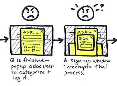
 After begrudgingly filling out the form and then choosing either “Ask” or “Ask Secretly,” another modal window popped up. This required the user to sign up or log in, in order to continue asking the question. This action led most users to feel “tricked,” which angered them and diminished their trust. At some point, a third modal window—another sign in feature—also appeared behind the other two, adding more confusion. Closing these windows would lead to a failure in getting the question asked, so users felt trapped and extremely annoyed at this point, if they were still engaged at all.
 A summary of the user flow and response to Task 1: Ask a question.
Prescription: Better UX Design
ChickRx needs professional UX relief, fast. What’s the remedy? Let’s examine a few ideas.

Giving the user value before requiring them to sign up is a good practice.
1. Follow the example of Medium and other sites: give value to a new user by allowing her to engage with the site before asking her to sign up. This would eliminate the sign-up windows that popped up at inopportune moments.
2. Rather than mimicking Google’s autocomplete prediction model, take a cue from Quora: allow the user to ask a question—without interruption—then present a popup that checks for similar, existing questions.
3. Give the user feedback after she asks a question. At the very least, a confirmation message should appear. A better idea is to display the question with editing options. The site needs to evoke a sense of trust and safety in order for users to feel comfortable asking personal questions. Giving the user a chance to immediately delete or reword her question would increase trust.
 In the proposed interface flow, the user asks a question and the site checks for similar, existing questions. If the user continues with her question, the next screen displays her question, confirming that it was asked.
These ideas are the seeds for a better UX design solution and a more positive response from the user.