Applying design principles to visual communications increases clarity, readability and memorability of the intended message. Five key principles include hierarchy, proximity, alignment, contrast and repetition. These principles can be demonstrated simply with nine-square grids:

Following are brief explanations of each principle, along with good and bad examples applied to postcard designs.
Hierarchy: prioritizing information based on importance.
Good use of hierarchy ensures that the most important items are noticed first, and it guides the viewer’s eye through the page or screen to see additional information.
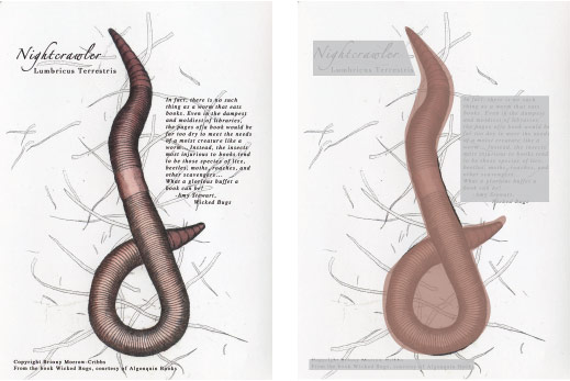
In this example, the nightcrawler is the first read. It takes priority through the use of size, color, shape and texture. The title and body copy blocks are secondary reads, and the copyright information is the last read.
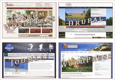
This postcard for web development services displays a poor example of hierarchy. The four boxes and titles are of equal size, resulting in a busy layout with no clear priorities.
Proximity: grouping, or chunking, elements together.
Proximity helps the viewer interpret information correctly and easily by showing which elements are associated with each other.
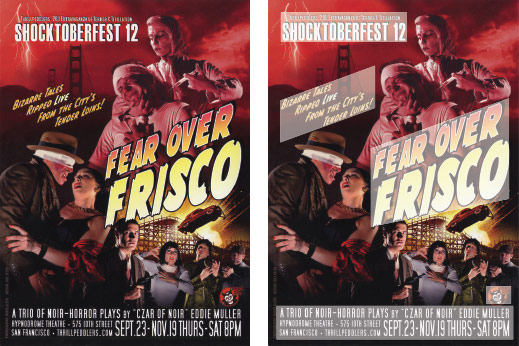
Information on the Fear Over Frisco postcard is grouped into sections according to meaning: performance group and event name, tagline, headline and logistical information.
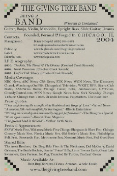
The back of this postcard for a band does not make use of proximity. Information is divided into sections, including LP Discography, Media Coverage and Press Quotes, but without any spacing between the sections it is difficult to quickly grasp them. The result is another busy layout that viewers would likely not invest time in reading.
Alignment: lining up and organizing content using a grid.
Aligning elements creates structure, making information easier to grasp.
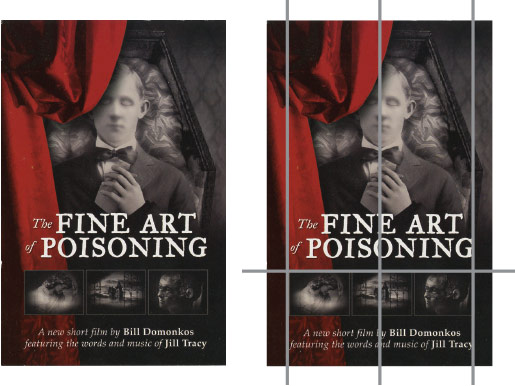
The Fine Art of Poisoning card employs a centered alignment from the dead body’s face to the copy blocks and row of images. The text and images are also aligned to the margins of the card, and the three images are aligned horizontally. All of these choices result in a structured, organized layout.
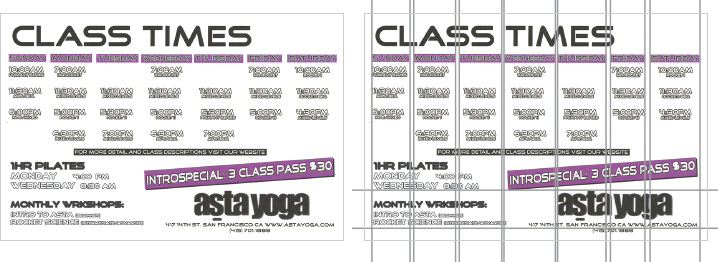
A calendar is a perfect example of content that can be aligned to a regular grid, but in the case of this yoga class schedule, the designer missed an opportunity to make the card more readable. As shown by the gray line overlays, the size of the columns and gutters are uneven, and there is a missed opportunity to horizontally align the type at the bottom.
Contrast: differentiating content.
Contrast creates clarity and readability.
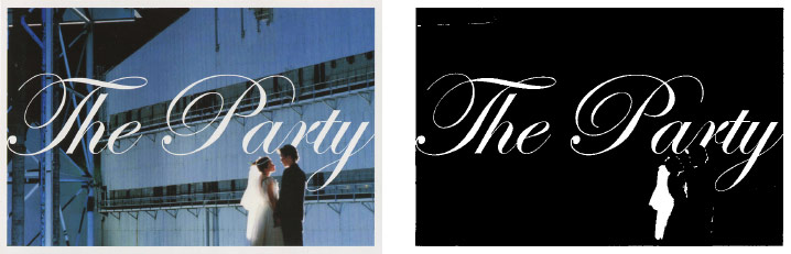
This card for a wedding reception party uses contrast effectively. To the right is an exaggerated version that highlights the key areas of contrast—the bride’s veil and the white type.
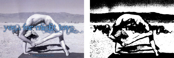
This card for a yoga instructor is difficult to read due to lack of contrast. The headline, set in a fancy typeface, does not stand out against the body due to ineffective use of the drop shadow, type color and placement. The URL at the bottom does not have enough contrast to stand out effectively against the yoga mat. Additionally, the shapes created by the body, its shadow, the landscape and the headline all lead to a busy, confusing design. The high-contrast version to the right exaggerates the problems.
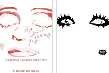
Repetition: using similar elements or properties of elements multiple times.
Repeating elements unifies and organizes a layout to direct the viewer’s eye across a page.
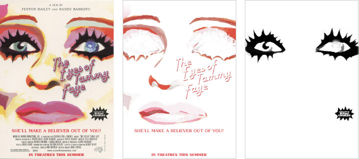
The Eyes of Tammy Faye card uses repetition of color and shape effectively. The reds draw the eye around the page, all the way to the bottom, and the black mascara-laden eyelash shape is cleverly repeated to call out the narrator’s name (RuPaul Charles).
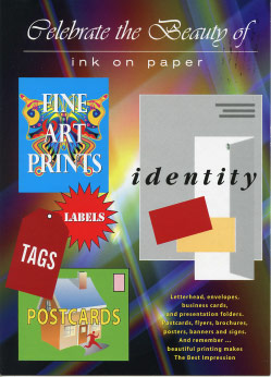
This promotional card for a printer also incorporates repetition of shape and color (rectangles and reds), but overall it’s not effective in leading the eye through the design. Other principles that are poorly executed on this card contribute to the problem.
All Principles at Work
The promotional card for 4by6, a printer based in Oakland, California, is an excellent example of the five principles at work. For hierarchy, the photo is the first read, and the G46 headline is the second read. The repetition of the blue color helps guide the eye around the card, as does the grouping of information into logical sections. Contrast is evident in the type colors and photo against the white background. 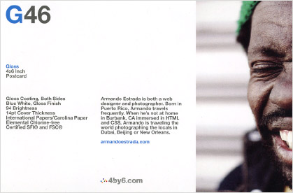 The size differences between the photo, headline and body copy are another form of contrast. Alignment provides the structure: three elements are aligned along the left margin, the two copy blocks are top-aligned and the logo is left-aligned to the second copy block. Balance, another principle, is achieved through good use of proportions and the placement of the G46 headline in relation to the man’s eye-catching expression, particularly the mouth.
Make Life Easier for People
As illustrated by these postcard examples, skillful application of visual design principles makes the difference between a professional, clear communication piece and an amateur one. Good design minimizes the cognitive work required by people, making the process of navigating through our information-dense world a little easier.
Image copyrights are held by their respective brands and licensors.